Sunday 25 December 2011

New Logo and First Gig Poster Back!


One of the bigger projects I've done in awhile is the new logo for my band Push To Twist. The reason for it being is it's the band's second coming since March with new members. This logo is a series from the first one being a hot rod car now to a hot rod plane. There is an idea behind the plane going into our stage show but I don't want to give much away as we haven't had our first gig yet. I animated the plane as I would with a car and I'm happy with the result and hopefully this will be seen around a lot more.


Here is our poster for our first gig back. I'm very happy with the way it turned out. The original idea for it was to be based on n old 1930s comic book cover but I was finding it a bit hard to get it to much what we wanted out of it. With that idea still in mind it became an advertisement from that time still. The overlay of the old, worn paper at the start wasn't meant to be so dominant but once I put it on I knew it was perfect, it gives it a constructivism look which fits the era still with the style of plane. I used both Illustrator and photoshop.

Sunday 4 December 2011

Design Jobs


This logo is for the Beaters Car Club. They already have the logo and type done and asked me to put colour and a background on it. I got the idea from the style of cars that are in the club. It's very custom/hot rod based. Hopefully we'll be able to see it on t-shirts, jackets and stickers soon!

This is a very recent job i just did for the band, The Black Aces. They are a rock band from Bendigo. The brief was very open as long as the photo and type logo was there. The Style i went for is what hard rock bands from the 70s, 80s would have. I think it fits very well with the type of music, it looks like its made to be pasted up in the city streets, it's bold, simple and effective.

Monday 24 October 2011

Logo Art


The drawings here I had worked on for the last couple of weeks as ideas for a band's new logo. These three did not get picked but I'm still very happy with the result of them and I used a cell shading with them and i think it suits well with my style. It was a bit of a challenge drawing people again but i enjoyed it and I've decided to draw a some portraits after my current project to get back into it.

Thursday 18 August 2011

Tafe Projects!

 I thought it'd be good to post up some of my favourite tafe work from last year as it shows a bit more what I do and really enjoyed working on these as most of them were my own briefs.
'Chromed' I drew a series of four cars in this style and decided to use one in context and i came up with a  car show poster. I was very influenced by art deco and I wanted to give it a look like it was to promote a show in the 50s.
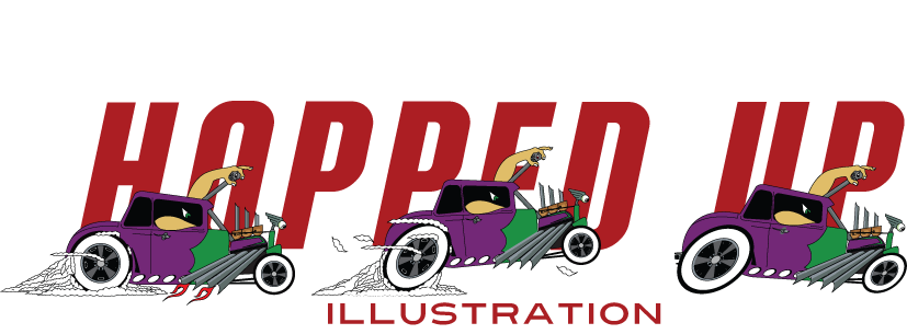
'Hot Rod Illustrated' This is a magazine cover with all hand drawn type. I wanted to completely cover the page with as its the main focus. I had fun adding all the little icons and colour in it too as it's something i don't do too often.
 This is a brief i did drawing up logos for my band Push To Twist.
'Apache Chooch Horseman' The hot rod was just something fun to have and it involves something about all the members.
'The P2T Train' The drawing shows all the members as pirates on a pirate ship/ steam train combined. This was an idea that too far but it was worth it.
Very soon this logos will be getting changed somehow as two of the members left I thought it was a good excuse for a new start!
 This character was for the Tim Burton Exhibition competition which was to draw up a character inspired by the Burton. I drew up the idea fairly quickly as I'm a fan of his work and love comic design. Once again after drawing the first one i decided to draw up a few poses and facial expressions. I'm still planning to draw up a short comic about him.
This is a car I drew for a client who approached me at a car show. I took my inspiration from the hot rod show logos and characterised the skull and tongue air filters by making them larger and alive. This drawing is framed up in his shed next to the car.
The left image i drew at a Dr. Sketchy day in the city. The model of the day was a burlesque performer Lux St. Sin. I was pretty happy with the quick sketch I did in the session and I knew I could develop it.
The image next to it is a large scale ink/watercolour piece focusing around the Japanese culture. This task had a word list to chose from and this is what i came up with. This must be a earlier photo as I decided toward the end to colour the back tattoos and it did bring the picture right up. 

Tuesday 26 July 2011

Overdosed

Here is an idea I had about a month ago for a drawing for a mate's car. It's his VL Turbo and I thought the title would be a good license plate for it. I also thought it'd be fun to draw it in this type of style, as it's usually reserved for hot rod illustrations.

Big L's Chop Shop

I did this illustration for a friend of mine who owns his own custom car shop. He asked for a drawing of his own car, a Ford Pickup. I completed the image in Illustrator, using mainly the pen tool. Overall, the client was very happy with the final outcome. 

Saturday 4 June 2011

Introduction

Hi, my name is Robert.
I'm an illustrator/graphic designer from Melbourne, Australia, trying to break into the scene. This blog will document my journey there. I mainly draw cars, and I'm heavily inspired by the hot rod scene. I also drive a custom XP Falcon.

I'm also the guitarist in my own band, Push to Twist. My favourite genres are rockabilly, psychobilly, rock and roll, metal and glam. My favourite bands include Mourning Tide, KISS, MetallicA, Misfits, Electrik Dynamite, L.U.S.T, Stray Cats and Steel Dragon.

I gather my inspirations mainly from American comics, like Batman, Johnny the Homicidal Maniac, KISS Kompendium and various other publications. I enjoy illustrators such as Max Grundy, Nate Holmes Trapnell, Joe Whyte and Jirat James Patradoon.

Thanks for checking my blog out!